 About Me
Statistics Unit (BHS Weeks 1-3: Year 10 Maths)
In the first three weeks I was still getting to know the class, and still getting aclimatised so I didn’t yet feel very comfortable innovating or trying different things/ coming up with my own ideas, so i let my mentor teacher drive the teaching for the most part. For this reason we decided to go with the summative assessment item my mentor teacher had planned on giving them based on an activity done in the previous term. In hindsight I think this was a bad idea, and my mentor teacher agreed, in that the task was very linear and limiting, and was not my own original idea and so the lack of ownership I felt for it led to pretty mediocre results when delivered to the students. If I was to teach a similar unit again, I would keep the intro and wrap-up activities and replace the assessment item with an investigation based around one of those activities (either the workplace data or the gapminder graphs).
Before my first lesson with the class I discussed with my mentor teacher what kind of lesson-planning process they wanted from me. At first we adopted a process of collaboratively writing a google slides presentation as a form of lesson planning, although later as my mentor teacher saw my teaching and began to trust that he could just let me teach with class with minimal supervision, even this became less often and lesson planning was mostly relegated to informal verbal discussions between me and my mentor teacher. For this reason I don’t have traditional ‘lesson plans’ for this unit, instead having planned the lessons around what needed to be done in the lesson and around the learning objects and activities, which I will include here.
I discussed with my mentor how to start the statistics topic and wanted to start with an open ended question focused on some workplace data to try and get the students to explore the data and find something interesting. After some discussion I suggested using (Gapminder)[https://www.gapminder.org/tools/] instead, and after taking a look at it my mentor teacher got on board with that idea.
Introduction Activity (Gapminder, Week 1)
We opened the first lesson on the new topic (statistics), with a motivational video which we would link back at the end of the of topic, but for now linked to the idea that having a whole bunch of awesome data, or amazing analysis, is completely useless unless you can communicate why it is important to someone else. This bridged the link to the activity which we then kicked off on interpreting data. We introduced this activity with the aid of our `lesson-plan slides’. We got students in groups to choose a chart type at random out of a cup, go on the Gapminder website and find something that sparked their interest, and present on it using their chart type at the end of the week. This served as an intro to the topic, as well as an open-ended activity to push them outside of their usual comfort zone and present to their peers while practicing their communication skills.
Summative Task (Memory Game, Week 2 into 3)
In week 2 we gave them the summative assignment for the statistics topic (also available as a *.docx file), based on analysing the data resulting from a memory game they played in the previous term. I and started helping them through it step by step. I delivered this section of the unit with the help of `lesson-plan slides’, simlar to the introductory activity, but with how I was still feeling a little uncertain with the class I also had more indepth discussions with my mentor teacher and wrote up a more detailed lesson plan/ notes
In order to provide the option for extension I made a flipped learning video series on youTube providing tutorials and instructions for how to complete the assignment while learning some programming. In order to facilitate this avenue I also provided a formatted version of the data and some example code. Ultimately none of the students took that route, but my mentor teacher did and they learnt something from it, haha. It’s also a starting point for incorporating more programming into maths units which is something I want to pursue in the future in general.
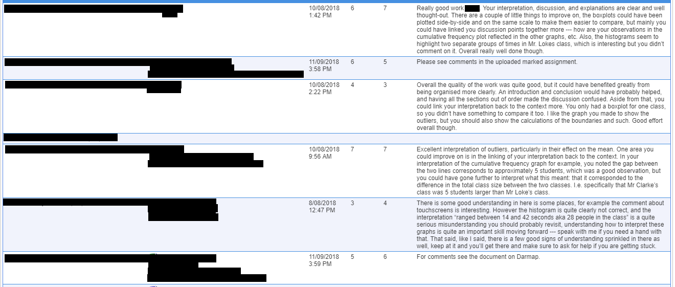
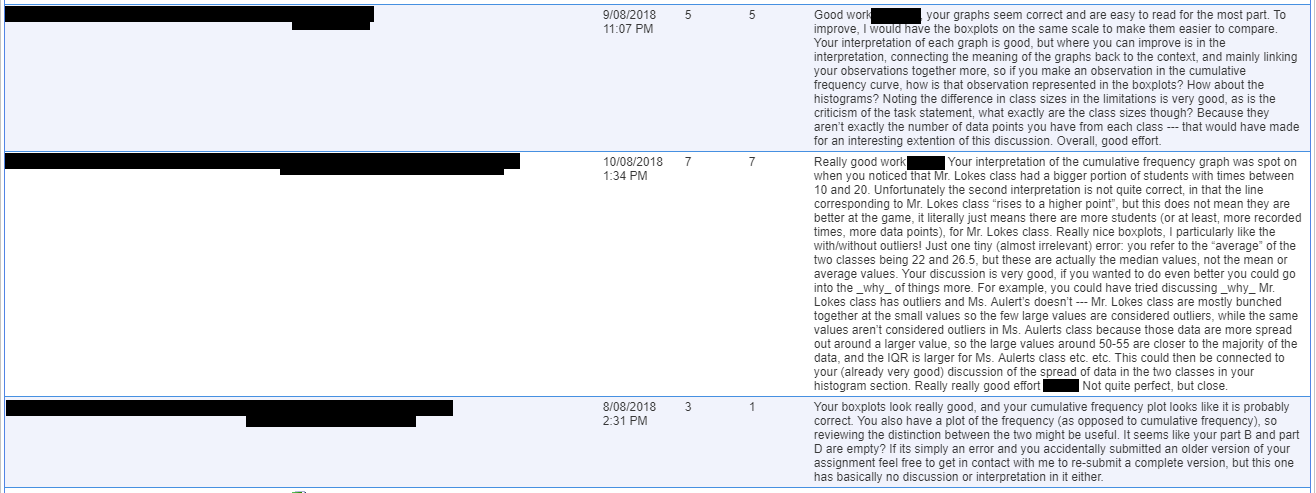
In week 3 we helped them finish off their assignment, for which I wrote up a few more “lesson notes” in collaboration with my mentor teacher to help keep me and the class on track. Once they handed up their assignments I marked them and after some internal moderation with my mentor teacher I then gave them feedback and reported on their results. Below are some work samples from some of the particularly nice assignments:
Marking and Feedback
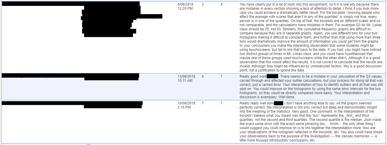
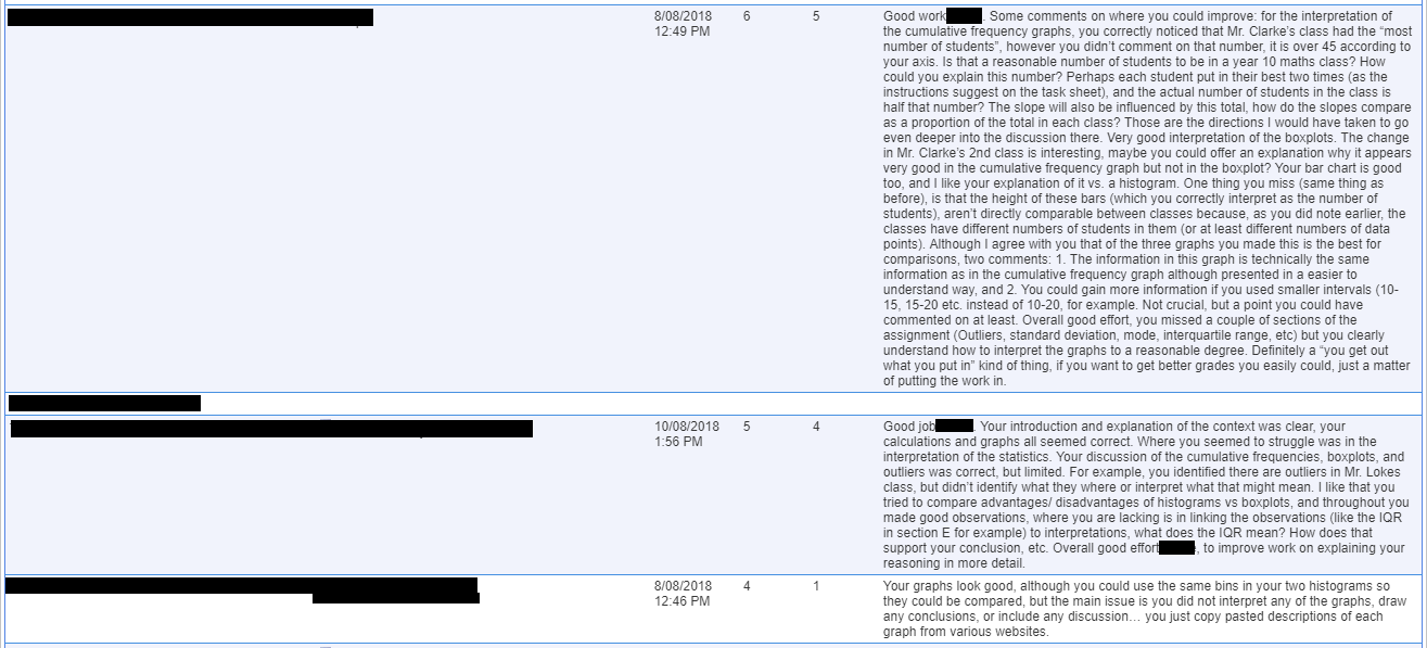
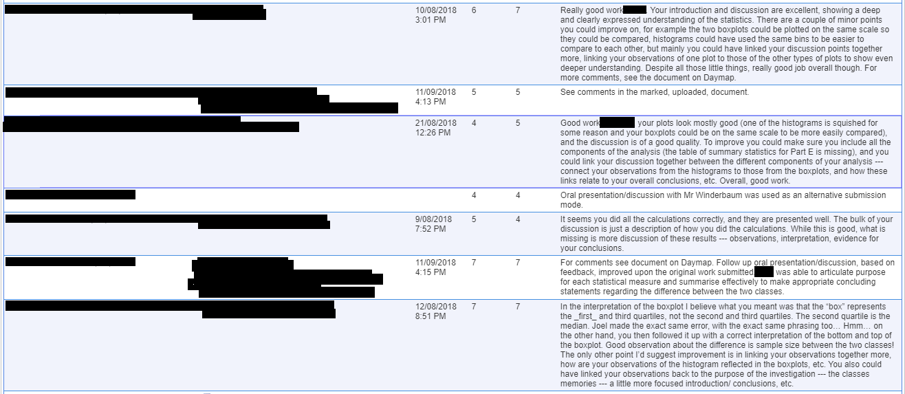
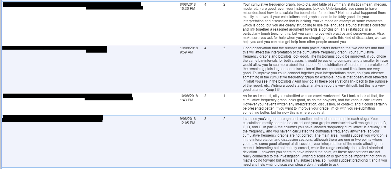
What follows is the anonymised feedback and grades I reported back through Daymap jointly to the students and parents:

Wrap-up Activity (Workplace Data, end of Week 3)
On the last day of week 3, with the assignment done and handed up for most people, we did a final wrap-up activity for the stats topic before moving onto the next unit in week 4. The wrap-up activity involved looking at workplace employment data, which linked to what the students had been doing in care group for the previous week, and linked back to the initial video shown at the begging of the unit. See the instructions I posted to Daymap for the students, which also served as my lesson plan:
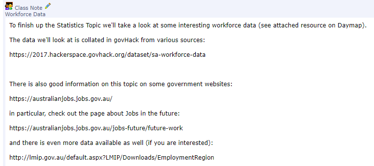
I showed them an infographic showing the distribution of employment by industry, and demonstrated how to use look at and interpret the hackerspace data. In particular, I highlighted that this data included information on Aboriginal employment in each industry:
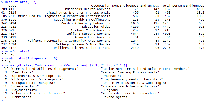
In the above screenshot, I highlighted to the students the top 12 industries as ranked by the percentage of people employed in that industry who identify as indigenous. Then, that 69 of the 359 industries in these data report employing zero people who identify as Indigenous. I then showed them a disturbing sample of 34 of these industries (that these data show as having employed zero indigenous people in South Australia in 2017), which highlights a breathtaking and disturbingly stark inequality in our workforce.
What I would do differently next time.
If I was to deliver this unit again, I would start with the workplace data that I ended on. The students showed some interest in it as it relates to their future careers. I would then scrap the memory game assignment, and replace it with a similar assignment but based around this data. So each student would choose an industry relevant to them — one they might be interested in joining when they leave school and join the workforce. I would then get them to look at trends over time for employment in that industry, but also to look at various demographics employed by that industry. This would include gender comparisons (for example, make a boxplot for the age of women employed in your industry, and another for the age of men on the same axes, to compare. This would then allow me to emphasise the comparison of Indigenous and Non-Indigenous employment in each industry. I could even look into getting some indigenous guest speakers to come in and talk about the issues they face in whatever industry they are employed in. Ideally, I could even draw on the parents and extended family of students in the class for this kind of contribution to the class investigation. At the end of the unit, we would share the results from the whole class with each other, to discuss overall trends, similarities, and this would be included in the overall assessment. I would also add a survey to give the students at the beginning and the end of the unit of their perception of inequalities in Indigenous employment to measure the impact of the unit in broadening their perspectives.
Note: The highlight above is the for benefit of university assessment, once that has been completed I’ll remove it.